Gemini_Generated_Image_t7fd11t7fd11t7fd.png

Teddie Rebranding

Chopsticks & Co. / Branding Identity
Student Work
Gold regional ADDY in branding

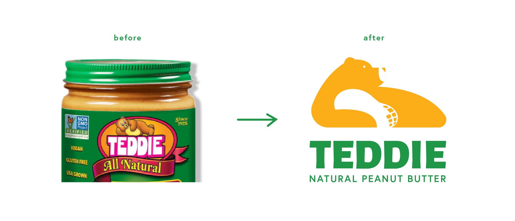
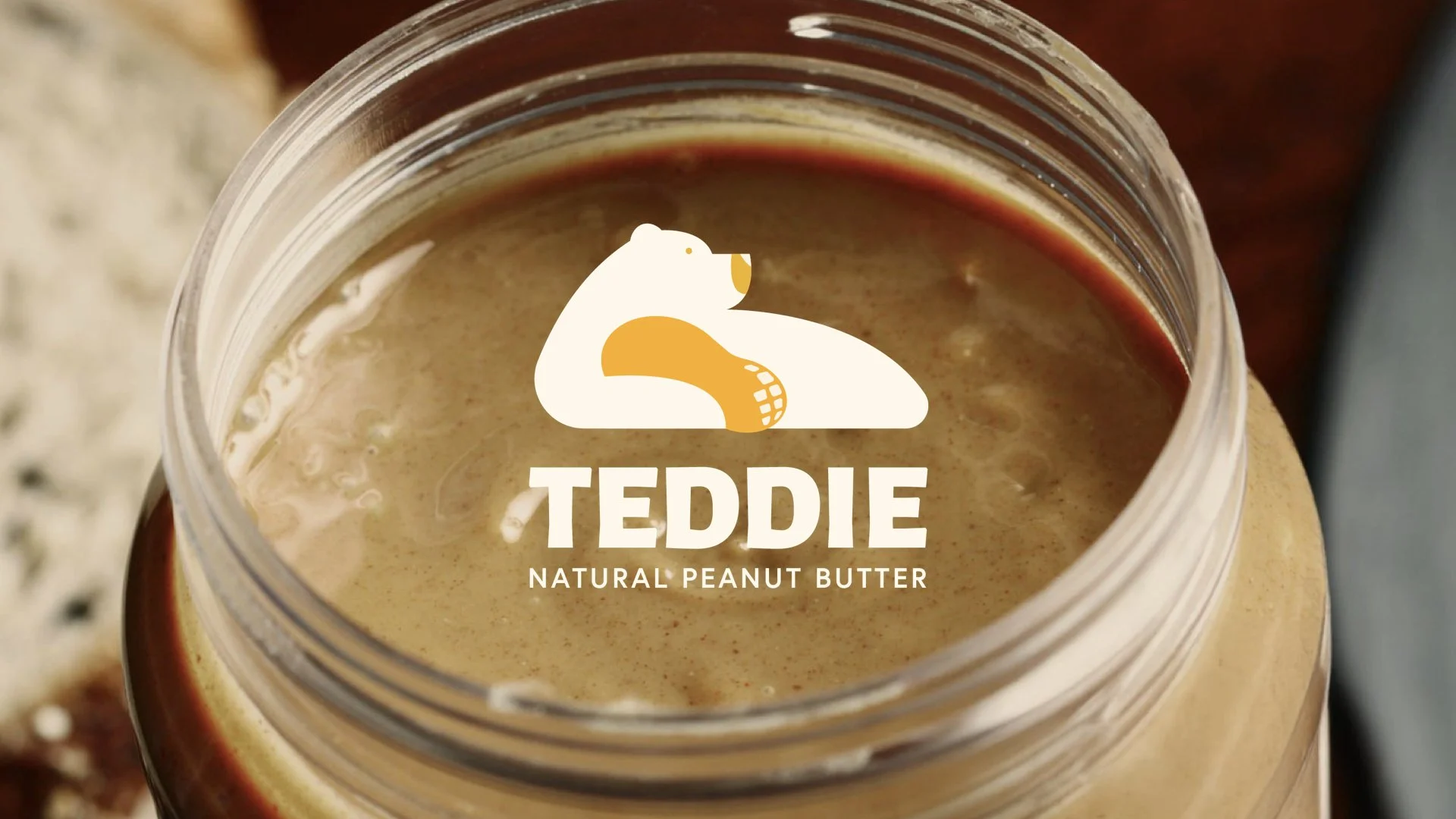
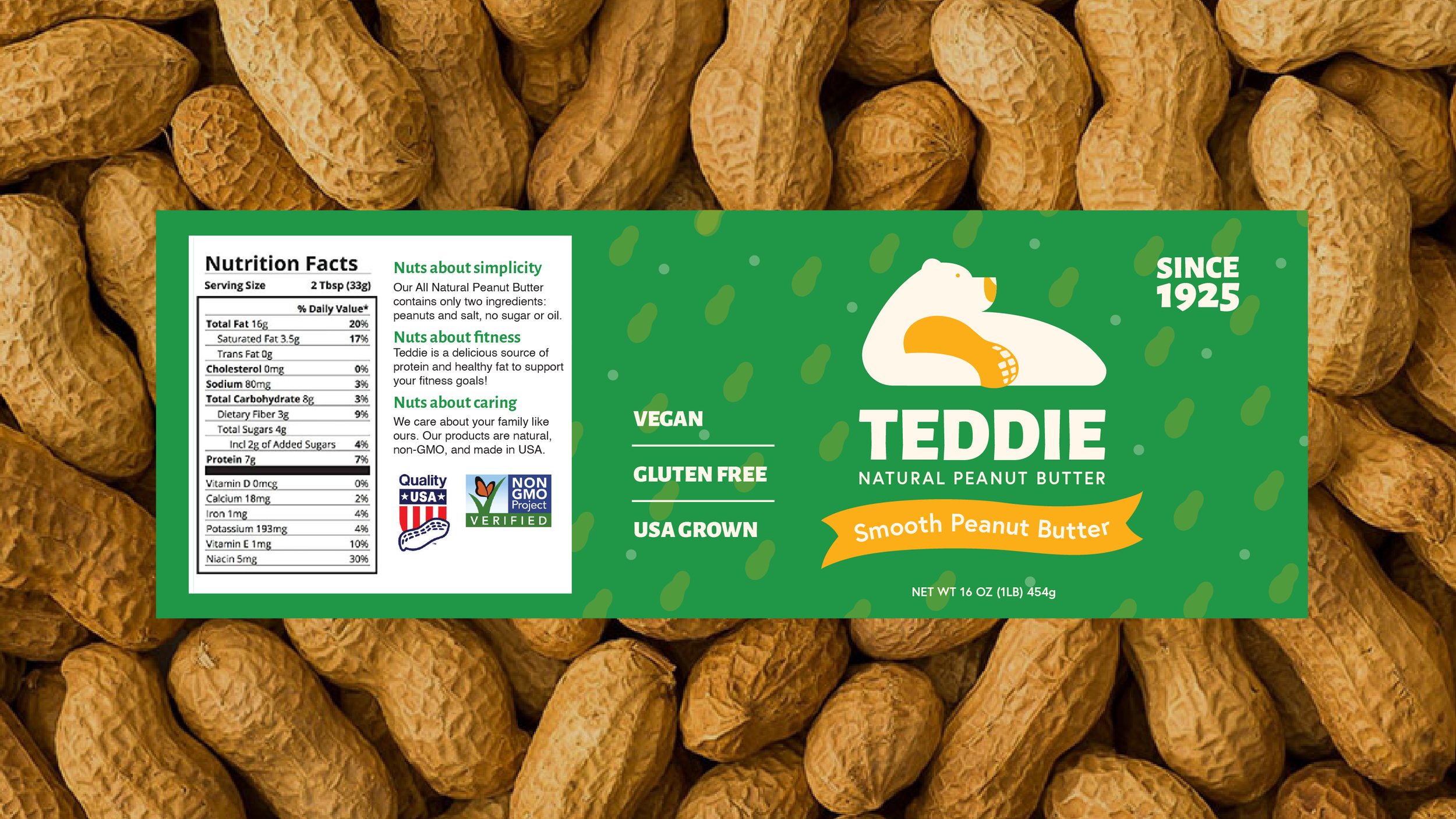
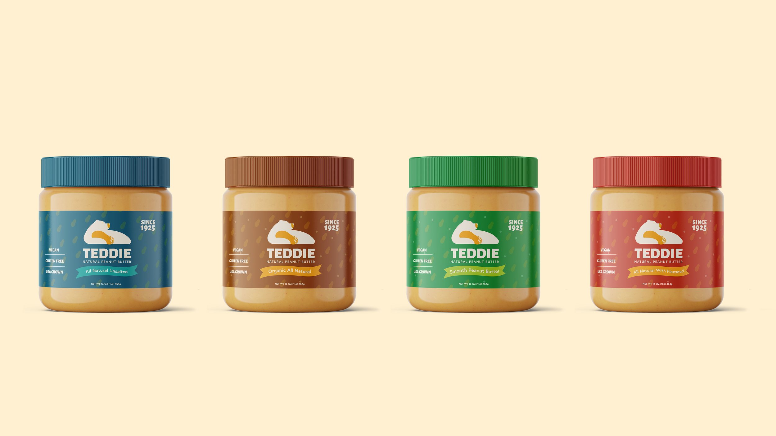
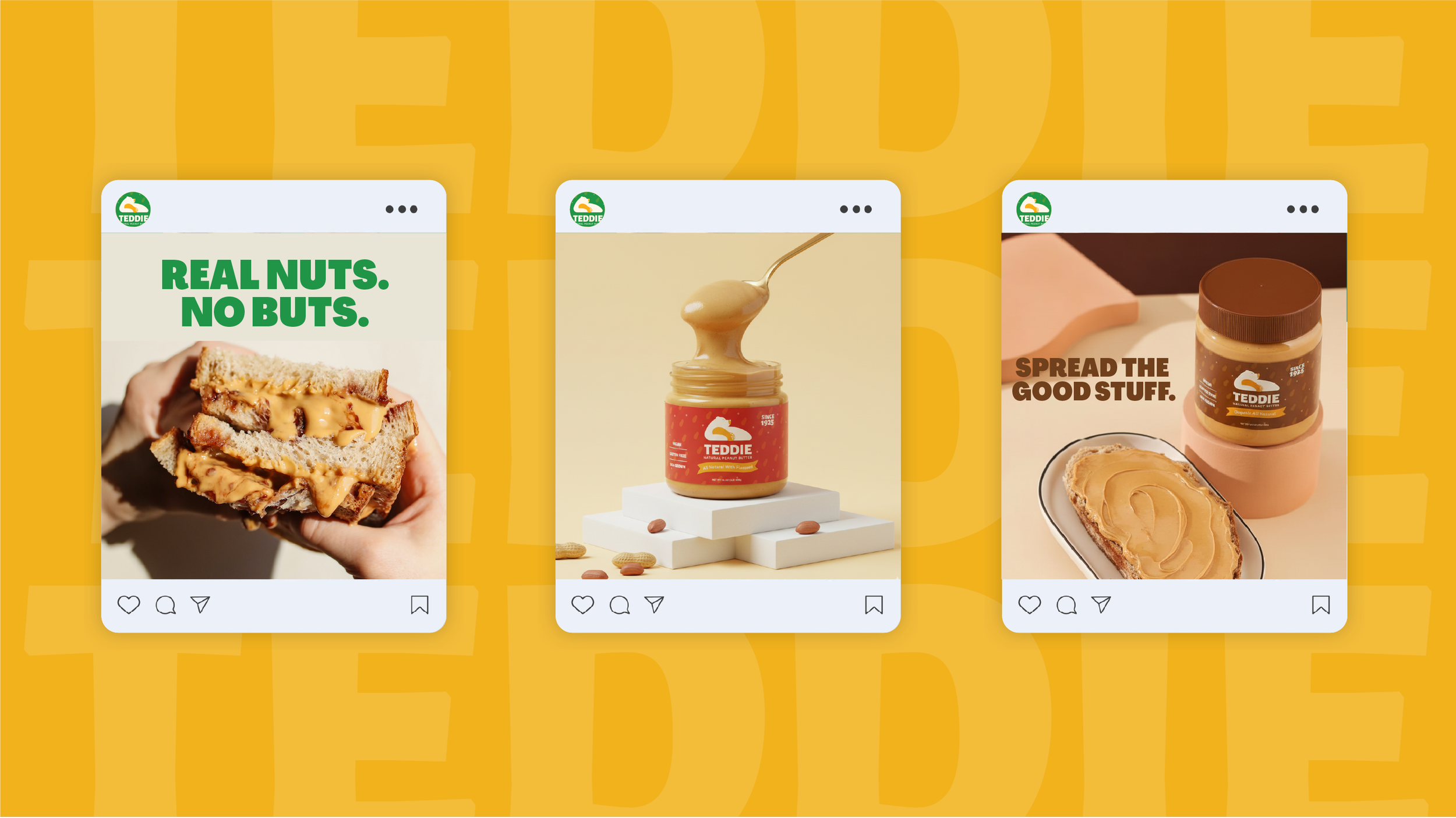
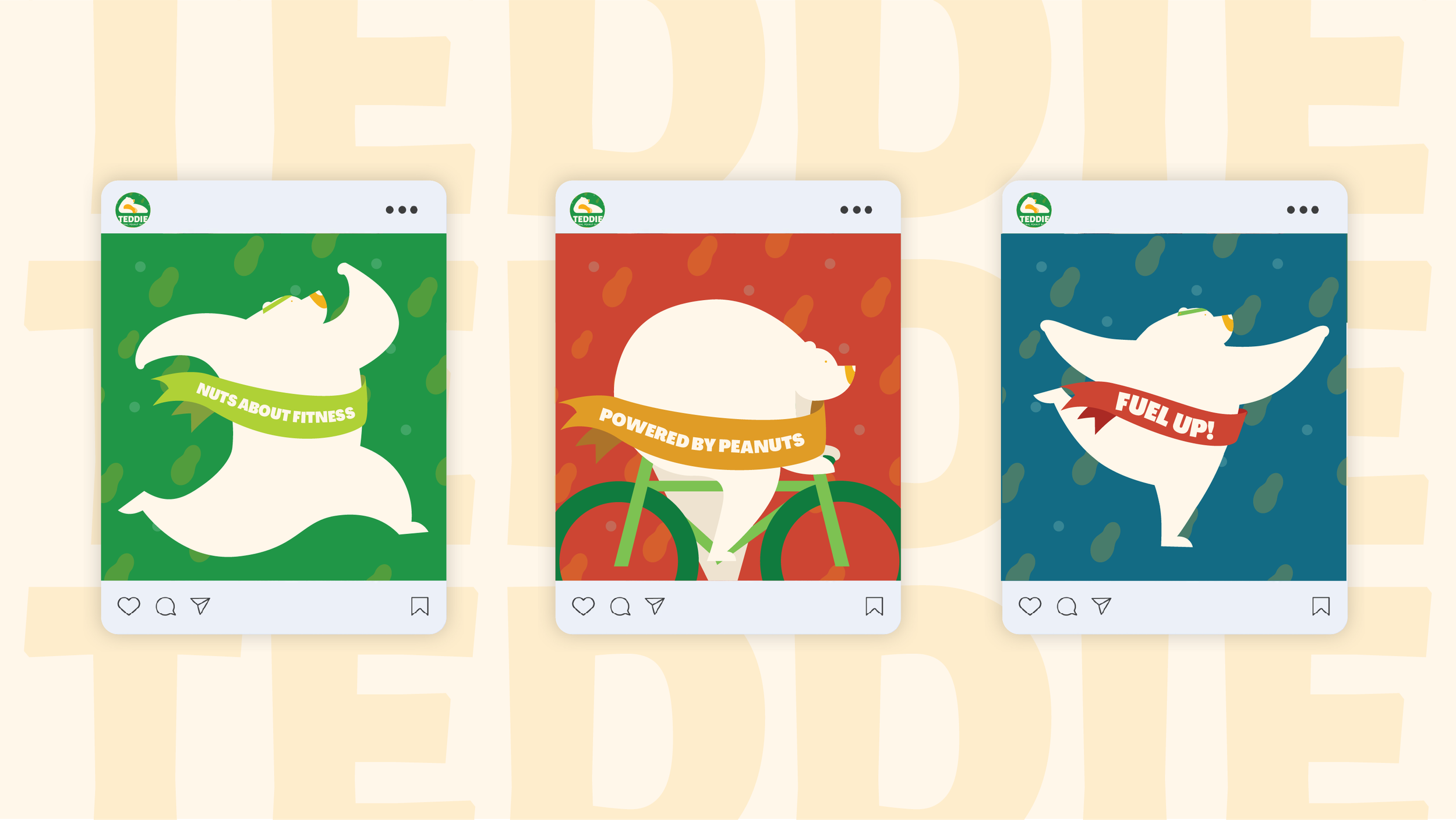
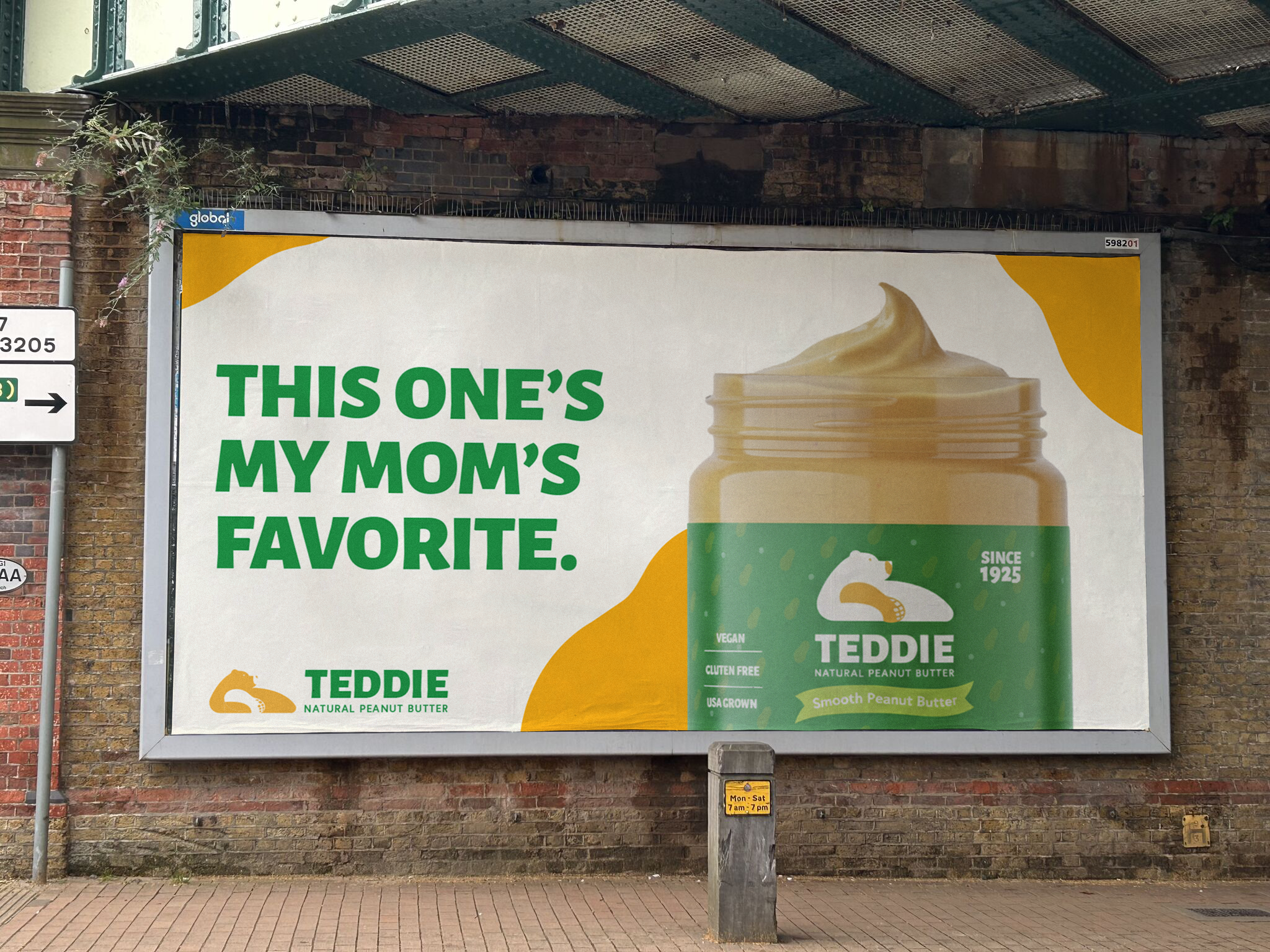
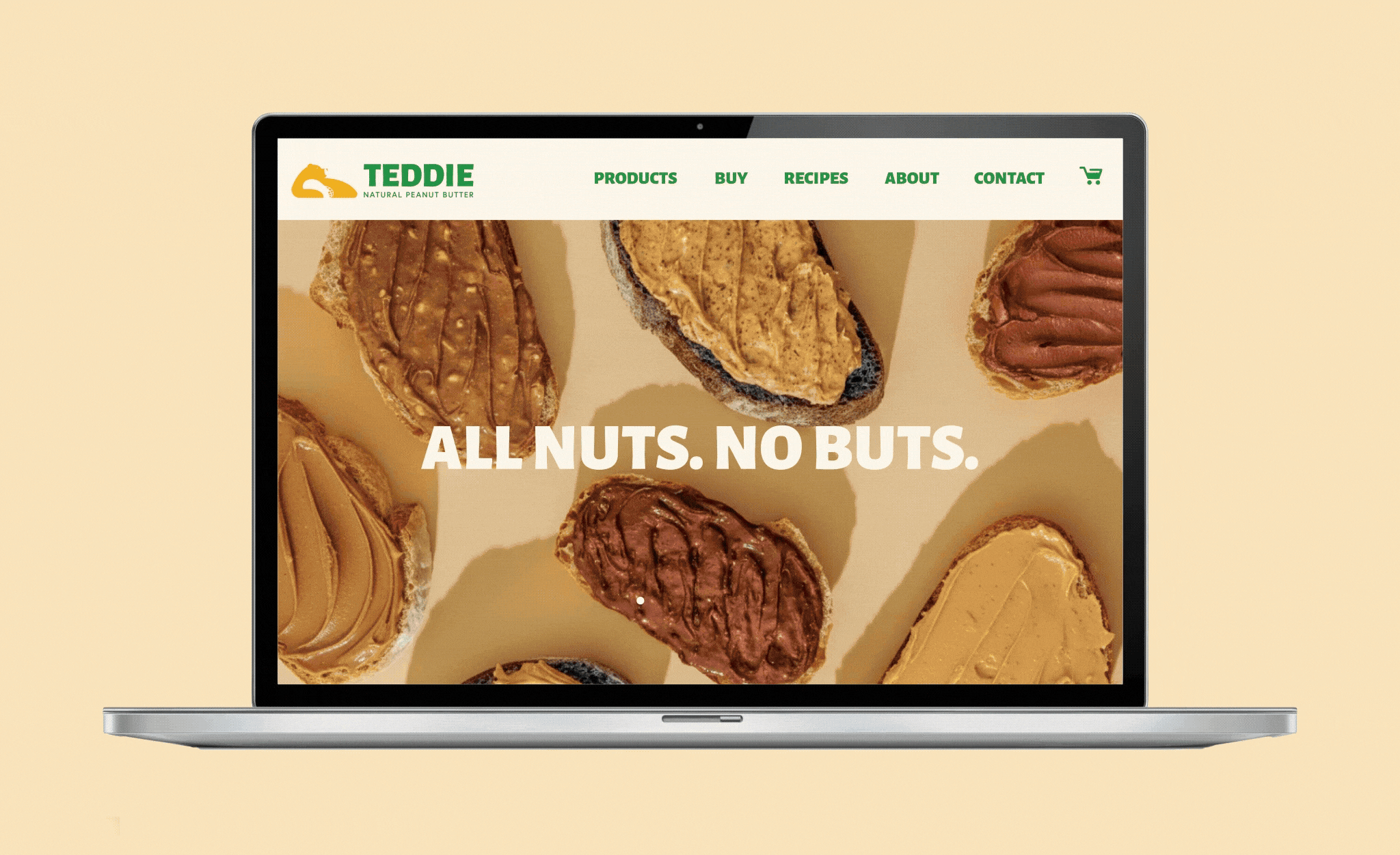
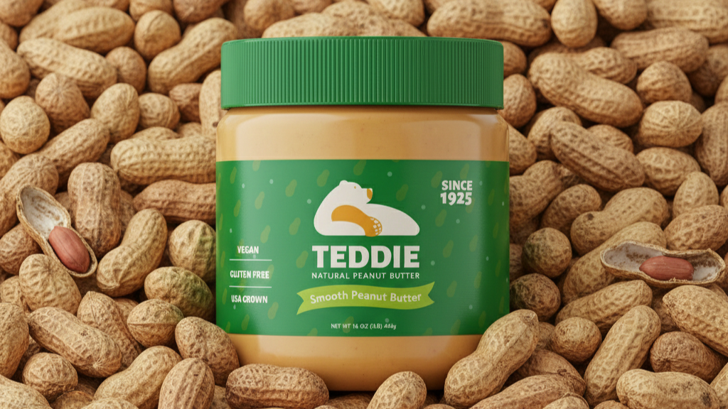
Teddie peanut butter is very well-known for people who are interested in health and fitness, however, their branding is falling behind. We revamped the brand with a brand new look and tagline: nuts about life. We redesigned the logo to be more simple and modern while keeping the signature reclining pose of the bear. The new color palette has a bright tone and signifies health, energy, and nature. The nuts pattern and the illustration of the bear are very eye-catching and versatile. They can be used for packaging or for social content.

Graphic Designer: Duong Le & Vy Phan

Teddie Peanut Butter

Branding Identity / Conceptual work

This personal project focused on rebranding Teddie Peanut Butter to give it a fresh, modern appeal while preserving its recognizable identity. To achieve this, I simplified the logo, keeping the bear as the core symbol but reducing it to a clean, side-profile silhouette hugging a peanut — playful, iconic, and instantly communicates the product. I chose Agrandir for the logo typeface, pairing it with Europa for body copy to create a clear hierarchy, and refined the color palette to greens, yellows, and creams with secondary colors to differentiate product lines. The redesign balances Teddie’s heritage with a fresh, modern look that scales across packaging, digital, and retail touchpoints.