The Lex_Canvas bag.jpg

The Lex

Magnus Chess Academy / Branding Identity
Client Work


After getting acquired by the world chess champion Magnus Carlsen, Magnus Chess Academy needs a new visual identity that appeals to younger kids (primarily 1st-3rd grade) with a look and feels that focuses on fun and play.

The logo design references the knight piece within the letter “S”. With bright, contrasting colors and chunky fonts, the logo has a fun, playful, and exciting vibe. The gaming app aesthetic will appeal to kids from beginning to advanced levels. The purple and orange primary colors, followed by vibrant gradient, yellow and cyan secondary colors give Magnus Academy a youthful, gender-neutral quality to its palette.

Graphic Designer: Duong Le
Creative Director: Allyson Paisley
Agency: DNA Seattle
Client: Magnus Play Group

The Lex

Pillar Properties / Branding Identity

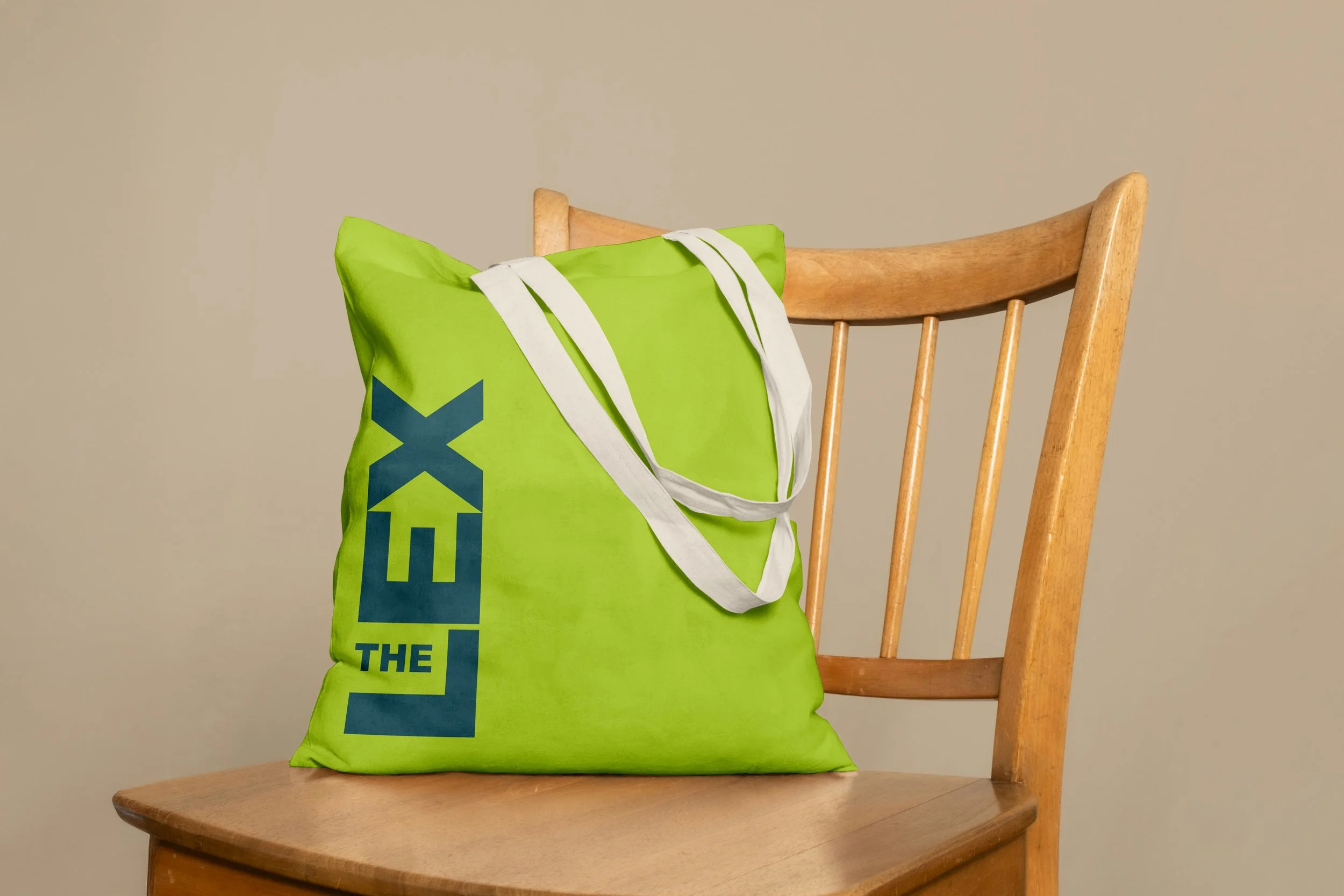
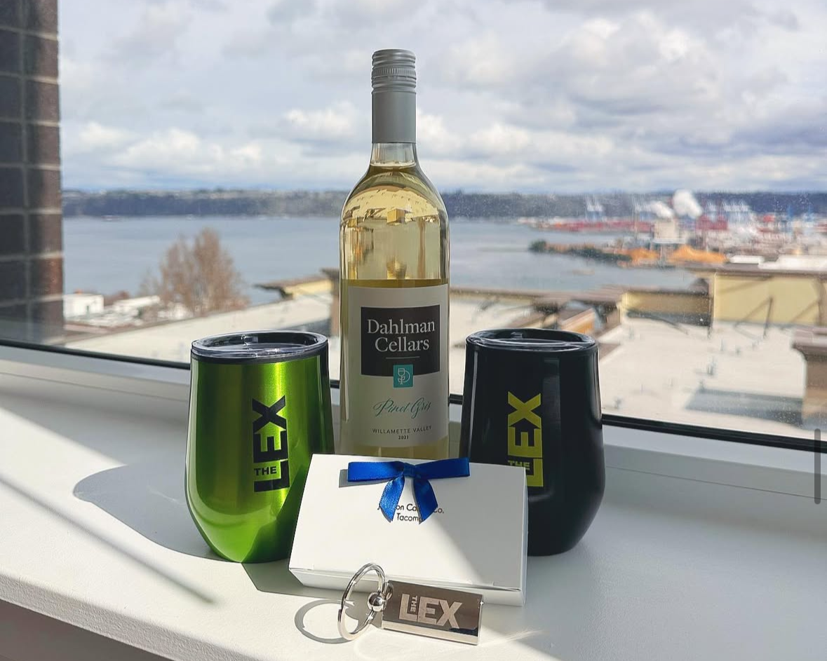
The Lex is a modern, high-end apartment complex in downtown Tacoma seeking a brand identity that feels both elevated and inviting. The logo features a subtle house shape within the letterform, symbolizing inclusivity and the idea of finding home at The Lex. A palette of fresh green, dark green, and navy reflects Tacoma’s natural beauty—youthful yet refined. Light green adds a modern, energetic touch, while deep green and navy bring a sense of luxury. The result is a visual identity that balances sophistication with warmth, perfectly aligned with The Lex’s urban, Northwest lifestyle.

Logo

Signage

Website

Merch

Creative Director, Allyson Paisley
Art Director & Designer, Duong Le